Millington's Bravest gets Two New Signs

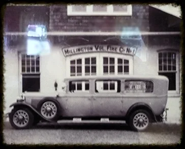
Six months ago we were approached by the department to recreate a sign they found in the station's photo archives. The company which celebrated its 100 year anniversary in 2013 wanted a handmade sign for the front of their building reminiscent of the sign in the archived photo. Not satisfied with just making a copy of the original flat hand painted sign, we were able to convince the fire fighters to have faith in our ability to create a custom sign design worthy of their sacrifice and dedication. We followed the basic layout of the old sign using old world techniques to add some dimension and sparkle. To enhance the hand crafted feel, we added a rough cut wood grained background. We raised the letters to add dimension using a 100year old technique called smaltz to add sparkle to the lettering with the use of crushed glass. To celebrate the companies belated 100th anniversary we added more smaltzand gold leaf accents to the founding year bubble at the top. Unlike the arched original door in the photograph, its replacement had a square frame which we covered with the sign filling in the corner with precisely cut sheets of PVC. 

During our initial meeting the fireman in charge of the project Mark Blajsa mentioned that visitors often had trouble finding the building so I recommended that an additional carved sign be added to the secondary entrance. We tied the two signs together by using the same shape and old world techniques to carve and embellish the sign, but purposely colored them differently so they would not compete. Just imagine trying to find this building without these carved signs and see how beautiful the building is now with them. These brave guys deserve the best and we did our best to deliver. If you live nearby, come take a look and see how we can not only inform but enhance your premises with our custom sign designs. If you would like to learn more about the Millington Fire Dept, check out their facebook page at https://www.facebook.com/Millington-Volunteer-Fire-Company-Long-Hill-Fire-Dept-182261171818971/.

Our Favorite Ice Cream Shop Reopens with a New Sign

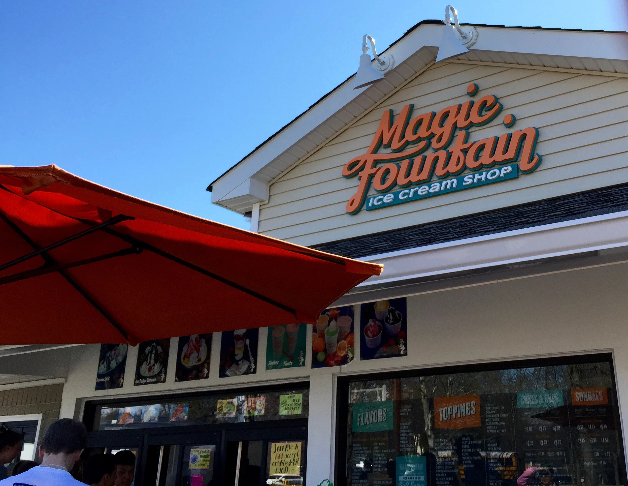
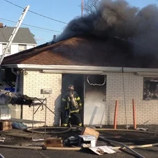
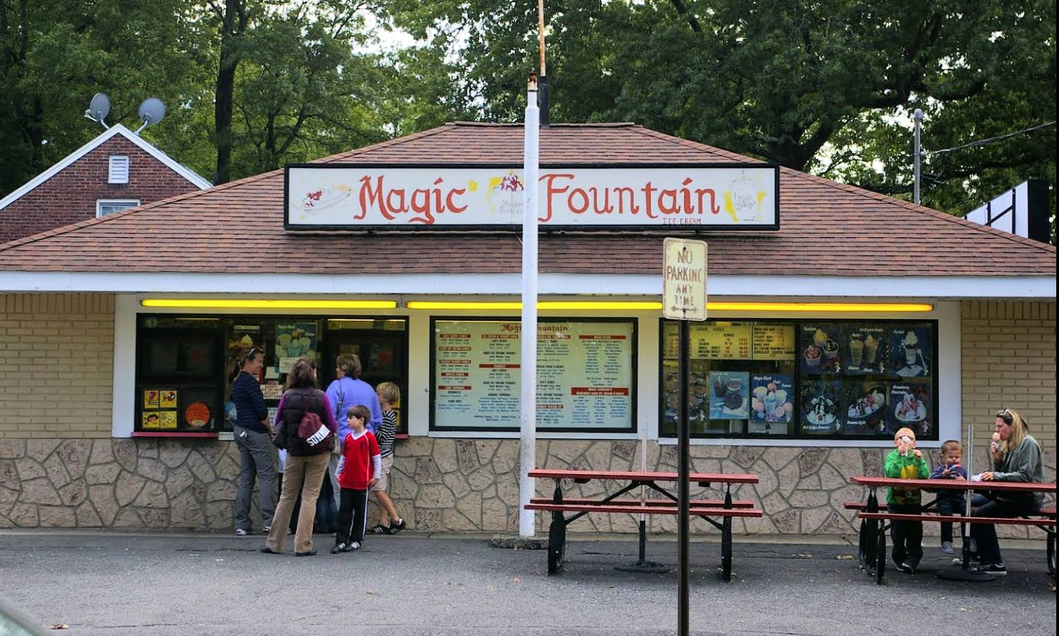
My favorite Ice Cream Shop since I was a teenager was Magic Fountain, so it was a real thrill to make their new sign. The building tragically suffered a fire last year which closed the doorsfor an entire season. Today we were in the neighborhood and decided to stop for a few minutes and enjoy a good old fashioned Banana Split, with Mint Chocolate Chip, and Cookie Dough Ice Cream, Yum. The line was long, but boy was it worth it. Stop by the Summit NJ location and enjoy the best ice cream around and while your waiting in line, you can enjoy our delicious handcrafted sign.

smART Kids learn about Signmaking

Summary Block
This is example content. Double-click here and select a page to feature its content. Learn more

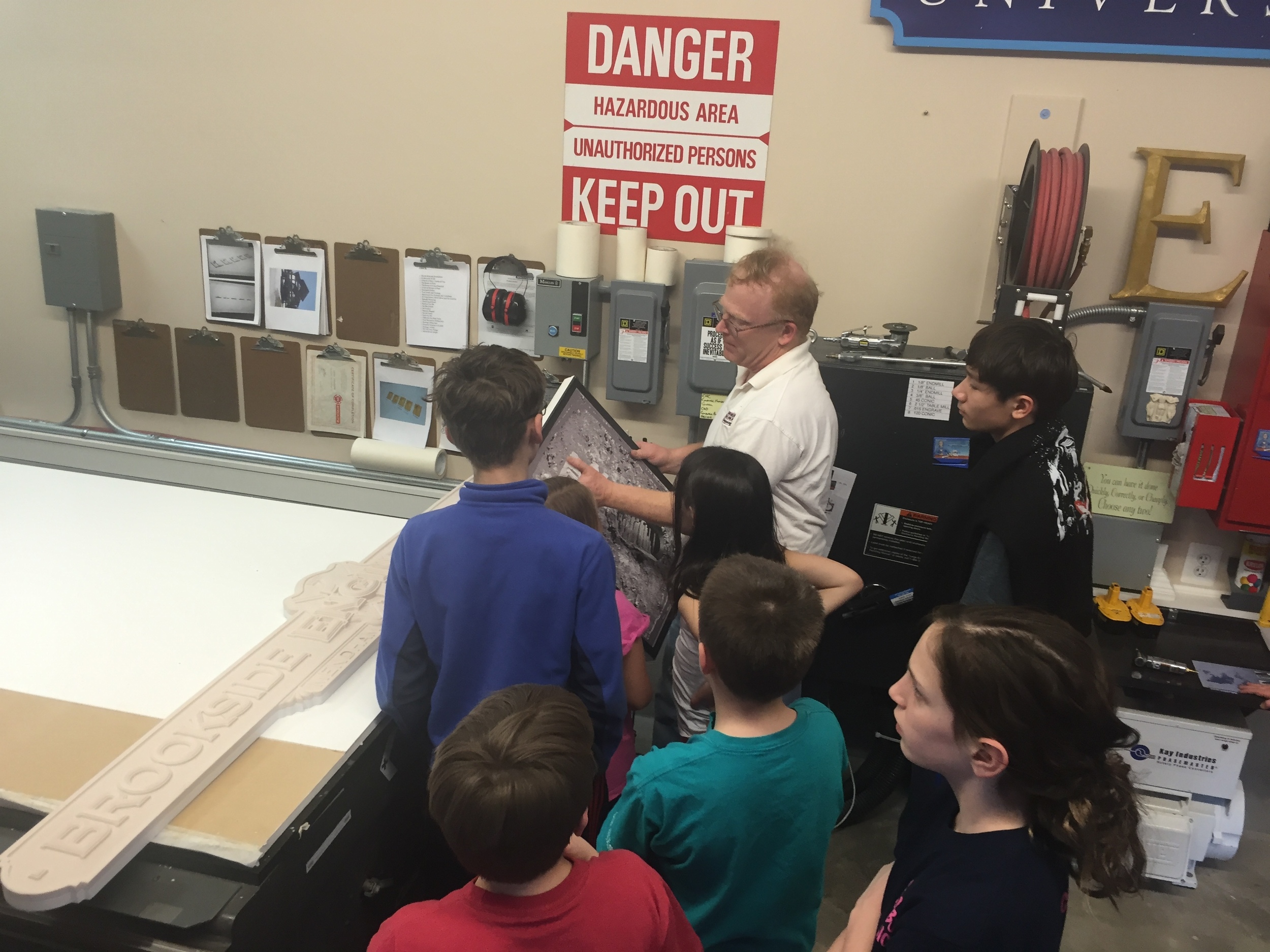
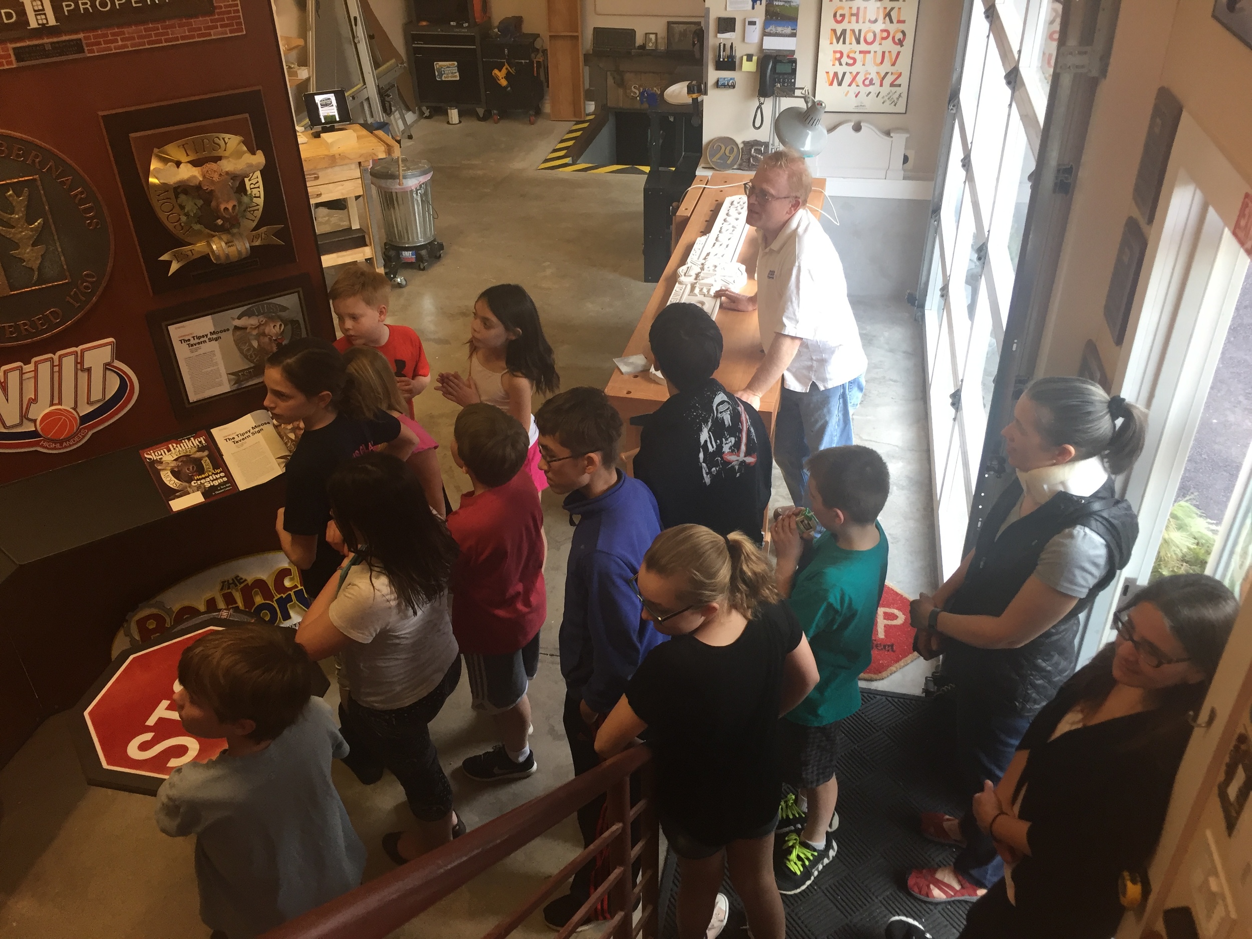
Today we had the pleasure of hosting a dozen budding artists from the St. Marks Episcopal Church smARTS program http://stmarksbr.org/smarts/. Thekids were great!. We gave them a tour of the shop, showed them how we make different signs and let them sculpt a crabs for one of the sample sign in our office. It was a fun experience for all involved.

Somerset Hills Lutheran Church

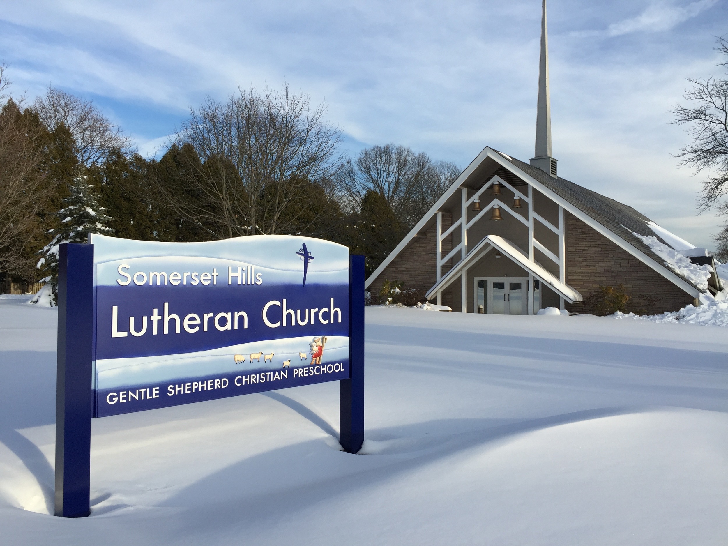
Just days before getting hit with record breaking snow falls, we were able to install this beautiful sign for our local Lutheran Church. We sculpted it out of High Density Urethane, PVC and Aluminum. It weighs about 300lbs and is built to last. Many thanks to Cheryl Delgado and Pastor Dan Fenco for giving us the creative freedom to to design and build this beautiful sign! The inside of the church is magnificent and the preschool receives rave reviews from all who attend, you should check it out at http://shlc.net., just don't forget to compliment them on the sign!

Merry Christmas to All

My present to the company this year and to all of you with mobile phones, ipads and tablets, I guess thats everyone, is our new mobile friendly website. It was designed by someone I consider a genius, Shane Durnford of Ontario Canada. If you are in need of a mobile friendly conversion or brand makeover, check out his work at http://www.shanedurnford.com, it will simply amaze!

This is the just the next step in our gradual rebranding of the company that began earlier this year with the redesign of our logo. Everything we have done over the past 5 years, our new addition and all the equipment we have added including our new Multicam 3000 CNC router has been to refocus our efforts toward creating bigger and better handcrafted signs for our customers and the communities we serve.